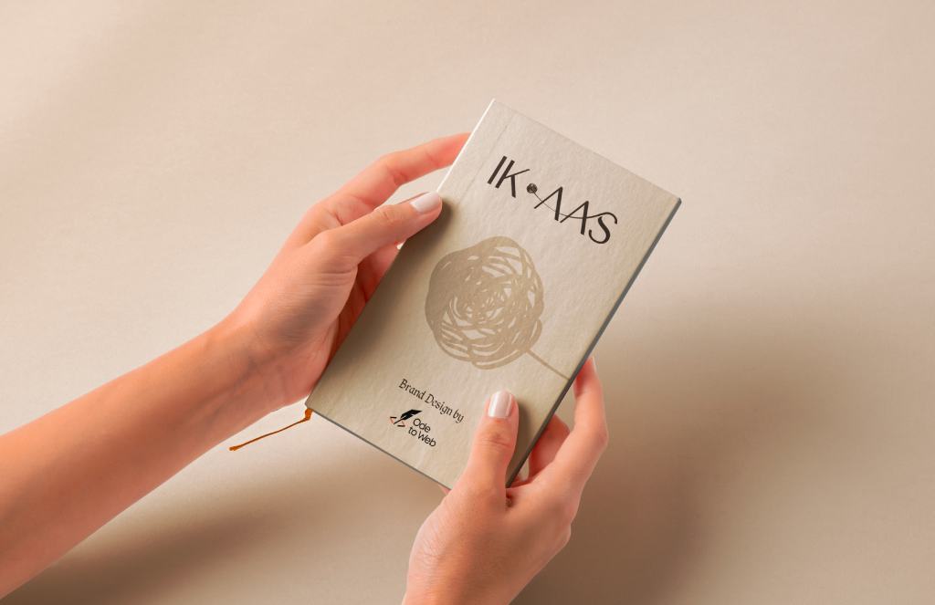
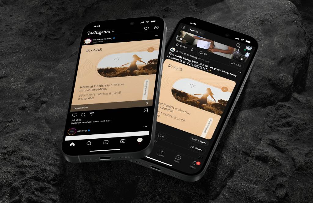
“IK AAS”, meaning “A Hope” in Punjabi, offers mental health therapy and support services to the South Asian community in the United States. The brand guidelines emphasize a minimalistic design, reflecting a clutter-free approach that parallels the principles of good mental health. This clean and simple aesthetic fosters a calming and supportive atmosphere for those seeking assistance.
IDEA BEHIND THE LOGO: The logo design captures the essence of a therapeutic journey, where the intricate pathways of the mind untangle, revealing a path towards improved mental health. As threads of confusion and distress unravel, they pave the way for a clearer, healthier state of mind.
The logo features complex, tangled lines at the center, symbolizing challenges in mental health. These lines untangle into a single line in the ‘AAS’ part of the logo, emphasizing on the meaning ‘ONE HOPE’.
The design remains simple, ensuring readability in both digital & print formats.
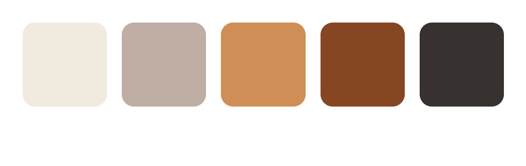
Color Palette
Color Palette
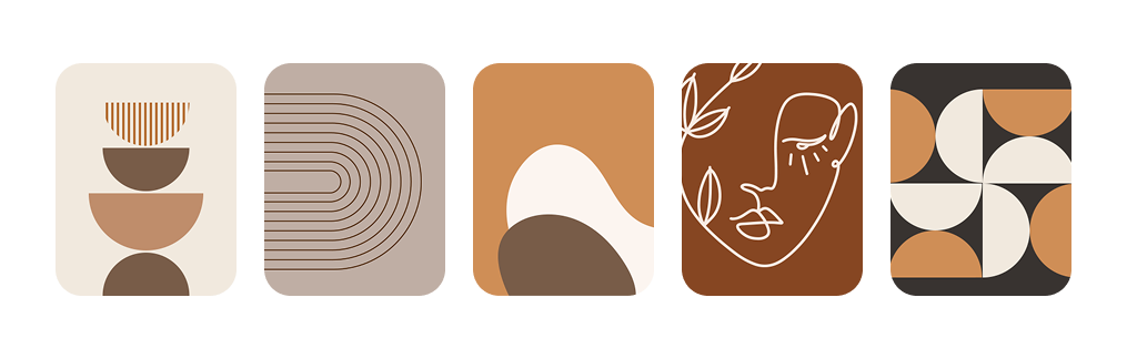
A mix of geometric, organic, hand-drawn and line art shapes